We’ve had some interesting chatter on the securitymetrics mailing list today about sparklines: tiny, intense, word-size graphics. This is one of Edward Tufte’s latest confections. His formal definition is here. An excellent example is the Nasa “ozone hold graphic”.
Pete Lindstrom asked whether sparklines could have some use in the information security field. Here’s an example, from my (as yet unpublished) book, Security Metrics (Addison-Wesley Publishing, expected 1H 2006).
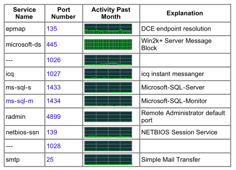
The first graphic (below) shows the distributed network intrusion detection project DShield. The small multiples are in the column labeled “Activity Past Month”; these show the relative number of hostile scans encountered for the network services enumerated in the “Service Name” column. Although the X- and Y-axis labels are not shown, it seems clear enough what they must be: the vertical axis scale starts at zero and increases at a linear—or possibly logarithmic—rate to maxima held constant in all graphs. The X-axis shows how the relative number of scans varies over time. Minor quibbles about labeling aside, the use of small multiples in this exhibit enables the reader to quickly get a sense of the which ports are most likely to be scanned: in this case, 445 and 135—two ports associated with Windows services that are often prone to compromises. A network administrator running an all-Windows environment, for example, might see this exhibit and decide to push out a group policy temporarily restricting access to these ports.
One can easily imagine how this exhibit could be enhanced. Instead of simply showing the “top 10” most-scanned ports, we could show the top 100, or a subset of the most common well-known ports. Doing so would require some graphical nips and tucks; the “Explanation” column would need to vanish, and we would want to combine the “Service Name” and “Port Number” columns. From the point of view of aesthetics, representing the scan results as solid filled area charts on a white background (instead of black) could increase the small-multiple format’s readability.
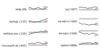
An intriguing small-multiple format that would work well here is the sparkline—a minimalist “simple, intense, word-sized graphics” format invented by Tufte. The figure below shows a fictitious re-drawing of the previous exhibit using sparkline format, constructed using Excel. Each mini-chart includes a dark gray line to show the trend for each cross-section, as well as a light gray band denoting the “normal” range; that is, the mean value plus or minus the standard deviation. So that the reader can understand the plot lines in context, the final data point in each series is highlighted with a red marker and numeric label.