Twenty years ago, a polymath prophet named Edward Tufte self-published an incendiary book, The Visual Display of Quantitative Information. It forever changed how a certain species of white-collar professional viewed the world. As a DNA-tested, confirmed member of the species homo visualis, I can tell you that his book, and successors such as Envisioning Information, taught me how to create strong, effective statistical graphics. Tufte introduced the concepts of chart junk, the data-to-ink ratio, small multiples and sparklines. He argued forcefully and persuasively that designers of statistical graphics need not condescend to their audiences. And perhaps most important, he inspired a generation of authors, professionals and scientists — call them “Tuftees” — to strive for simplicity, clarity and honesty in their representations of data.
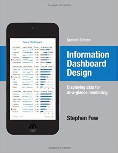
Indeed, in my book Security Metrics: Replacing Fear, Uncertainty, and Doubt, I wrote an entire 40-page chapter on how to graphically present security data. That chapter owes everything to Tufte. I mention my own book not out of a desire to gratuitously promote it (not that there’s anything wrong with that), but because in the 2nd edition of Stephen Few’s Information Dashboard Design: Displaying Data for At-A-Glance Monitoring I can sense exactly why and how Mr Few was driven to write his own book about visualization.

In my case, I felt compelled to summarize quickly everything I had learned about effective graphical techniques, because I wanted to help security professionals create exhibits that weren’t awful. After I put fingers to keyboard to write the chapter, though, I found it hard to stop writing. No treatment of security metrics would be complete without an honest discussion of visualization techniques, and that took space and length to do well. Cranky about the state of graphical practice in my own industry, and lacking decent models to point others at, I decided to build some of my own, often imperfect, models. (Really cranky, too: after re-reading chapter 6, it’s a wonder Addison-Wesley let me publish the book at all!) In short, pissyness led to something productive.
You can smell the same faint alternating whiffs of frustration and hope in Mr Few’s book, too. He’s my kind of cranky. He’s a Tuftee. The first half of the book, about 110 sparse pages, focuses on what not to do when designing dashboards. Dozens of examples of bad dashboards fill the first hundred pages. I can only imagine the nightmare of getting screenshot copyright clearances from the vendors whose products he made examples of.
But despite the sport he has with the screenshots, Information Dashboard Design also grounds practitioners in the basics. Few defines a dashboard as:
…a visual display of the most important information needed to achieve one or more objectives, consolidated and arranged on a single screen so that the information can be monitored at a glance.
That is nicely said. Building on this fundamental definition, the first half of the book covers these additional topics:
- Clarifying the Vision: What is a dashboard? Why do we use them?
- Thirteen common mistakes in dashboard design: exactly what you’d imagine; this is a regular rogues gallery
- Assessing what’s needed: what people need when they see a dashboard
- Fundamental considerations: how frequency of use, screen sizes, and data types influence dashboard design
- Tapping into the power of visual perception: how we can use what we know about cognition to improve perception of dashboards
- Achieving eloquence through simplicity: A Tufte-inspired discussion of maximizing the data/ink ratio, and of getting rid of filler and unnecessary ornamentation
- Advantages of graphs: why pictures are worth a thousand words
The remainder of the book covers putting theory into practice. I have not read these chapters yet, but am looking forward to them.
If you are a Tuftee, you won’t find much in the first half of Mr Few’s book that breaks new ground. At least, not as of 2013. But then again, in 2006, this book was a big deal. It was well-received, sold well enough to merit a second edition, and has been widely cited since.
I admire Mr Few very much for writing this book. I don’t get the impression that he was a graphic designer by training. Nor does he appear to have an economics or statistics degree — indeed, I can’t find a résumé or LinkedIn profile anywhere. And he’s not a programmer. Not that any of that matters. Few is clearly a fanatic; he won’t change his mind, and won’t change the subject.
The principles in this book don’t apply just to dashboards, however. Every business professional who creates any kind of chart or exhibit can benefit from this book. I can say that with a high level of confidence — and I haven’t even gotten to the really good bits yet.
Stay tuned for my review of the second half of the book.
